Spotlight On Scott Lewis
Oct 15, 2011
TID:
Scott, thanks a lot for agreeing to be a part of this.
We've known each other a long time, and we used to
photograph in adjacent cities for competing newspapers.
I never told you this, but I loved having you as "competition,"
not just because we were friends but because your work
inspired me, and it always pushed me to become a better
photojournalist.
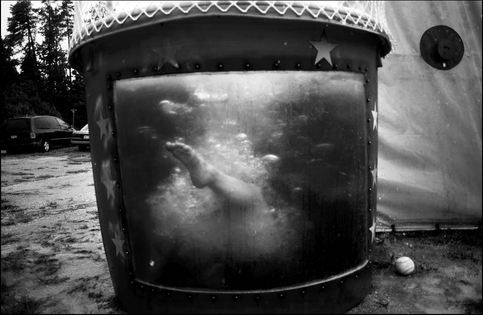
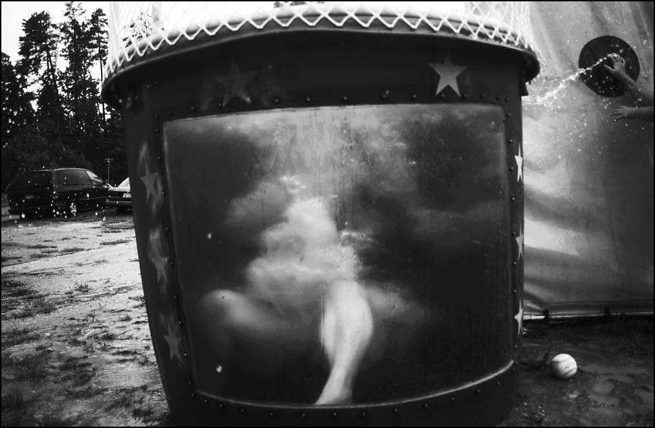
One of the images you made while working at The News &
Observer struck me, and it still resonates with me today. It's
an image I wish I had taken, and I still can't pass a dunking
booth without thinking of this picture.
Can you tell us about the assignment you had that day? Was
the dunking booth part of the original assignment or how did it
play into things?
SCOTT:
Thanks Ross. During that time when we were working at competing
papers , I'd see your work in contests I'd be happily surprised to
see you producing such great work but alternately saddened to
see that it rarely saw the light of day in the paper. It's a real honor
to hear you say that I was an influence. I've watched you evolve into
a really bold photographer with a strong point of view and if I or my
work had any role in that then I'm humbled.
This image was a part of a Photo Column called Acts of Faith
that I worked on for two years when I was on staff at The
News & Observer in Raleigh, NC. Each week we were
responsible for covering some aspect of the faith community of
North Carolina but mostly around Raleigh-Durham-Chapel Hill.
Research, reporting, scheduling, photography, writing, etc. was
done entirely by the photographer.
The column space was heaven, really, as it allowed for you
to direct a part of your photographic life and take some risks
that would then come back to influence your coverage in other
areas and in turn influence others at the paper. It was a great
showcase for creative approaches to reporting and storytelling,
that weren't controlled or influenced by others. As a result it
opened up more conservative-minded eyes at the paper as to
what photographers could do, and how great they are at doing
reporting in ways that challenged the status quo approaches.
This photo column, this was one of like 5 or 6, was part of a
wonderful overall team environment that eventually led the Editor
of the paper to see photographers as the among most creative
and aggressive journalists in the newsroom.
At first I didn't have any interest in the column but the Director
of Photography at the time convinced me that it would be good
for me to do and he was right. I discovered that not being religious
at all allowed me a particular insight into seeing the faith process
and understanding the value it held for those that were religious.
Over time I discovered that what I was interested in were not just
the oddball moments that are always interesting but the common
threads among all faith communities that bound people together.
A sense of fellowship, cultural identity, rituals, traditions, passing
all of these down to children, doing community service, etc. all
became themes that I looked for at each situation. The whole
point, for me, was to have the images not be like the ones in
the rest of the paper. I wanted to give readers a surprise in
content and style and hopefully deepen their experience of
the paper, and community.
It was my idealistic hope that each Friday it'd be someone's
favorite thing to look forward to.
I always tried to find just one picture in each situation. One frame
that was either meaningful, interesting or just plain quirky.
This picture was taken at a little carnival as part of this church's
bible lessons. Part of this section of the Bible talked
about celebration and fun and they'd just simply included the
dunk tank as a part of the carnival theme of their party. It was
really nothing special or unique. I can't remember how I found
out about the carnival. I could have found it by researching the
weekly listing of faith events or I could have seen something
while driving around, both of which were a couple ways I found
out about little happenings like this.
TID:
I have always been curious - was this image pre-planned in your
mind or was it more serendipity?
SCOTT:
Initially my thought was that I'd say this was pure response and
no planning, but the more I've thought about it there was actually
a decent amount of planning that went into getting this picture.
It's just that all that planning happened within just a few seconds
in my head. After you've been shooting a while, I think you forget
about what's involved in your shooting process and it becomes
instinct so even though there was planning it still felt instinctual.
With the freedom we had in this space of the paper, I tried hard to
transcend the obvious pictures or the kinds of pictures the paper
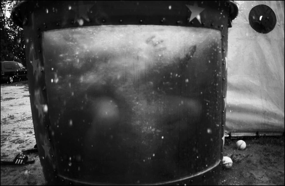
typically publishes. In this case, I remember thinking there could be
interesting possibilities as each person was dunked and thought that
it could be kinda cool to just view this scene from within the tank.
I'd say most of the images were just a blur of water (it required some
combination of concentration and luck while shooting as I couldn't
really see anything emerge within the tank, since it happened
pretty fast and there was no way of predicting, dunk to dunk, how
the person was going to react once in the water).
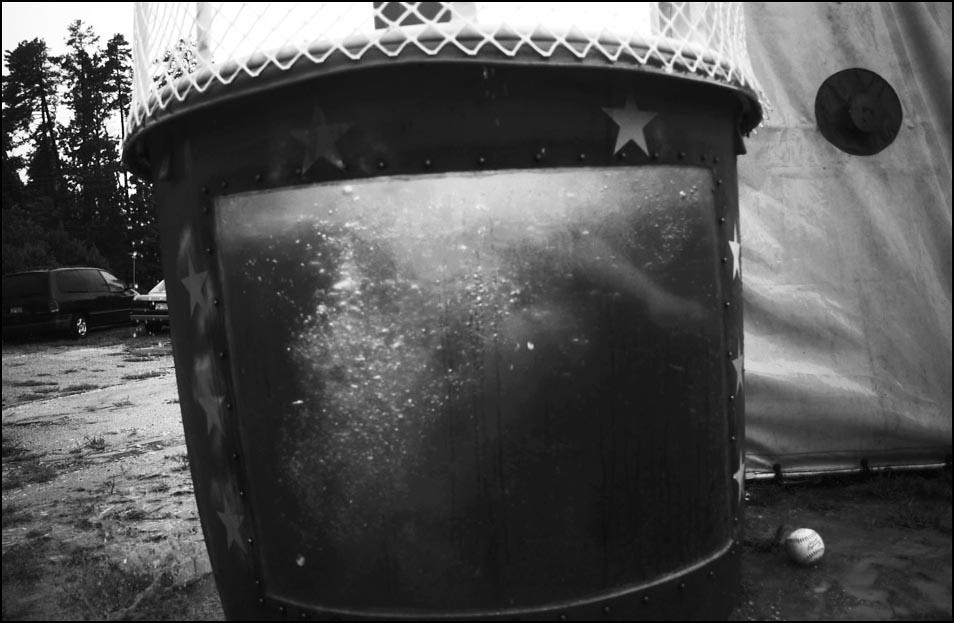
Most of the time it didn't make interesting pictures at all.
The murky water made it hard to see and it was starting to look
like it wouldn't yield anything.
Initially I was hoping for a face or something clearly dramatic/fun/
curious. But then in this one frame her foot popped out from
the center. If I'd gotten what I thought I wanted, like a face, it
probably would have just be ok. But somehow, I think, the foot is
more intriguing, more curious. If I can go this far, it's more immersive
because the foot is an implication of a person and that makes it
more mysterious or interesting than if I'd gotten what I initially
thought I wanted like a face. For me this picture was only maybe
a contender in color but once it was black and white and it toned
up nice and dramatic it was clear that it was a winner. This picture
accomplished what I was always trying for in the column space.
Taking the ordinary, often mundane, activities of a faith community
and transcending the literalness of the scene. Take the viewer into
a different place either because of access or ideas.
TID:
This sounds a little obvious, so forgive me, but do you have advice
on how to advocate for a picture like this running in a newspaper,
or for a news organization?
The reason I ask this, is that I can easily imagine an editor telling a
photographer they can't run this picture because it's too "abstract."
With this, what advice do you have for photographers on advocating
publication of this type of an image?
SCOTT:
That's hard because, at least in this case, I didn't have to make any
argument at all. This week the editor was in the office when I was
editing the shoot on a Saturday and he walked by the screen and
just calmly said "that's the one." And for the photo columns the
edits were often pretty easy in the "argument" sense. Photographers
were often left to make a lot of the editing decisions, within reason
of course, since they were really the most invested in the space. And
over time, the photographers that worked on the columns earned the
respect of the other editors. The photographers knew they had to be
responsible and the editors learned to give the photographers some
freedom to explore and take some breaks from the routine approach.
Even though there was all this freedom, it was always a collaborative
effort. Sure, this picture is a bit abstract for a daily newspaper
and would be much harder to get on the front of a Metro section or
even Page 1.
In advocating for an image like this, you have to be careful. You
have to make the right case, for the right picture at the right time.
If, for example, you're covering a contentious school board meeting
and make something abstract and more arty or interpretive, you might
end up wasting a lot of time arguing for it. Photographers can have
a tendency to fall in love with their ideas and their insecurity can
make them impatient about seeing it published, which can seem
like either complete validation or rejection. When it's not
published, some photographers can lose sight of the big picture.
Publishing or not does not take away that you made the image. The
reaction to your favorite shot not being published should be to
motivate you to find a way to get an edgier or more personal style
to have the same literal news "meat and potatoes" content as a more
literal image. Bring a distinct vision to each situation and eventually
it'll start to find it's place, but never sacrifice the basic need to tell
the story of the news in front of you.
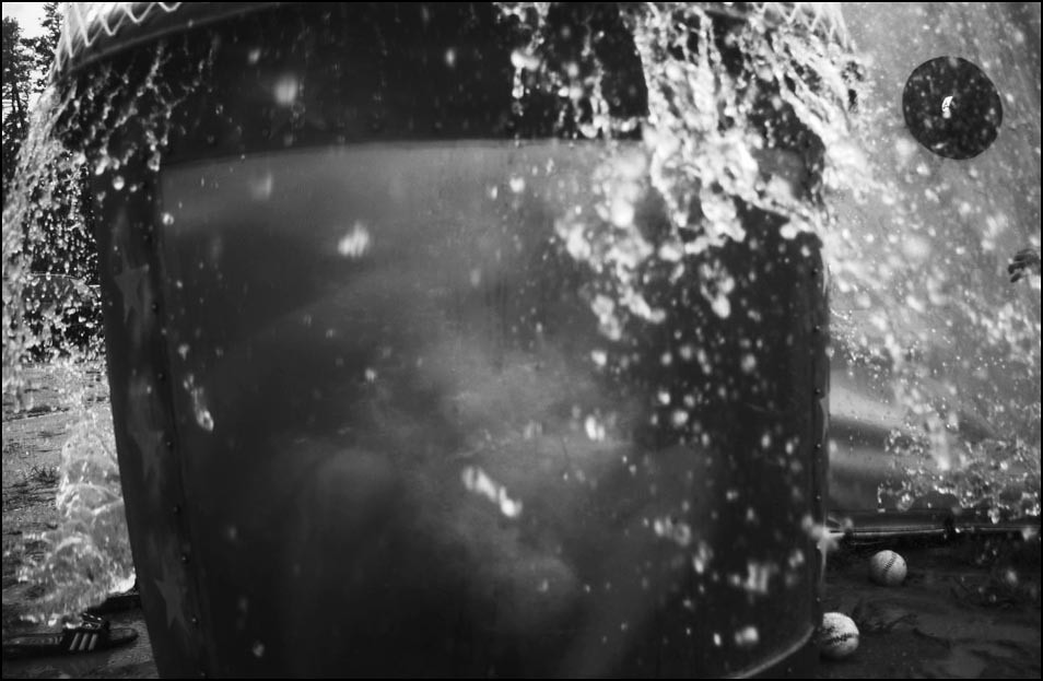
It's actually inappropriate to run pictures like this when the news
story, the reason you are there, is of a more literal "beginning-
middle-end" or decisive moment nature. There's a time and
place for these kinds of pictures. Just because you made an image
like this does not mean it's the best or right image to publish at the
time you made it.
If you make the wrong case, at the wrong time with the
wrong picture, you'll lose credibility and then when you do make
the right picture at the right time, your advocacy will fall flat. You
will end up "the photographer who cried wolf" and your editors
won't want to follow you in your reasoning. If you want to push
the envelope or the status quo, you have to be careful about
how you go about it. Photographers must be articulate advocates
for their work and the story. It can't just be about your vision.
For that there's the gallery wall. Publications have an obligation
to tell stories to their readers and photography is an integral part
of that process and photographers need to be sophisticated enough
to know when and where to make the case for getting more creative.
But of course you're never going to get photographer and editors always
in agreement about if you've got the right picture, at the right time with
the right case.
If you can't get the photo editors behind you then there's little to
no chance they'll go to bat for you with even more literally minded
word editors. When working as part of a team, you need to show
respect for the demands on an editor and not make their job harder
by wasting time on the wrong effort. It doesn't mean you shouldn't
challenge an editor's thoughts, that's part of our job as the
front-line, in-the-field component of the storytelling. However, it's
important to know when the argument is worth the effort. There will
be another opportunity.
TID:
in closing, can you talk about how you approach situations like this
in general? What advice do you have for photographers in seeing
outside the proverbial box?
SCOTT:
I don't want to sound cliche but there is no box. The proverbial
box, as it is, is all manufactured limits placed by us or others. If
you spend your time thinking that you need to work outside the
box then I think all you'll see is the box. You'll judge yourself by
the box and whether you thought far enough outside of it or not.
You'll end up over thinking the simple and under valuing your
instincts. For me, it can be like food. Sometimes the best, most
perfect thing in the world is a beautiful piece of fruit, untouched
by any crazy cooking technique but paired with an amazing and
surprising piece of cheese or glass of wine. For example, I just
saw this video (http://pdnpulse.com/2010/12/pdn-video-pick-dan-
saelingers-popsicles.html) on pdn that was about nothing more than
melting popsicles but it's done so creatively and beautifully that it's really
satisfying. It's really wildly creative but it's also really really simple
without being overly styled or heavy handed or pretentious.
It's just cool as it is.

My advice to other photographers is to trust and believe in your
view of the world. What do you find interesting and how are you
going to tell the reader about it? The most important accomplishments
for a photographer is that a reader or viewer walks away with a new
appreciation for something familiar or that their previous understanding
of the world has been challenged and even changed. I think young
photographers have a tendency to rely on gimmicks that are visually
cool or make the image look unique. But stripped of the easy to employ
techniques the images need to have value in and of themselves. Cool
techniques are fine to use but their role should be to reinforce an
already powerful moment. Over time technique fades and meaning deepens.
++++++
While lost and unfocused in college, Scott Lewis discovered the power of photography and never looked back. After getting his Masters of Arts from the University of Missouri, Scott had the opportunity to establish the photographic vision and approach for a new weekly magazine-style newspaper, named Fox Valley Villages 60504 for the zip code it covered in suburban Chicago. While on staff there Scott was awarded with the NPPA's Region 5 Photographer of the Year; the POYi Community Awareness Award and several awards for picture editing and Best Use of Photography. Scott then brought his approach to community journalism to North Carolina as a staff photojournalist for The News & Observer in Raleigh, eventually moving to the Northeast with his wife in 2005. Among many other awards, he has also received a First Place in the World Press Photo contest and was a 2005 recipient of a Getty Images Grant for Editorial Photography for a project on the evolving range of expression, belief and community in the increasingly diverse spectrum of faith in the U.S.
Now based in Philadelphia, where he lives with his wife Caroline and kiddos Ari and Margot, Scott, 42, works for a diverse set of clients and subject matter.
http://www.scottlewisphotography.com/
++++++
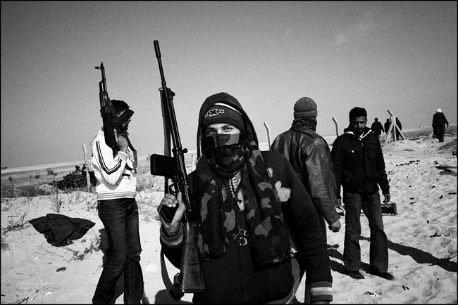
Next week on TID, we'll take a break from examining one image, and
discuss the mentality behind a collection of images from the conflict
in Libya by Greek photographer Angelos Tzortzinis
As always, if you have a suggestion of someone, or an image you
want to know more about, contact Ross Taylor at: [email protected].
For FAQ about the blog see here: